Showing posts with label teaching. Show all posts

Tuesday, February 5, 2013

subtly subverting art history

Claude Monet - Impression: Sunrise (oil on canvas) 1872

Georgia O'Keeffe - Red Canna (oil on canvas) 1923

Marcel Duchamp - Fountain (readymade) 1917

Roy Lichtenstein - Ohh...Alright..., 1964

Johannes Vermeer - Girl with a Pearl Earring (oil on canvas) c. 1665

Mary Cassatt - The Bath (oil on canvas) 1891-1892

Rembrandt van Rijn - St. Peter in Prison (oil on panel) 1631

Monday, December 17, 2012

hand turkey "Sky Above Clouds"

Georgia O'Keeffe - Sky Above Clouds IV (oil on canvas) 1965

In a recent trip to the Art Institute of Chicago I came across some collages that were created in response to the above O'Keeffe painting, from one of the education programs that are held in the education wing of the museum. I think the collages were made by elementary school students, but I can not be certain. I do know that I have seen these type of projects in many levels, from elementary school to graduate school MFA programs.

student work on view in the education wing of the Art Institute of Chicago

Some might argue that these type of assignments give students agency in and a perspective on what might otherwise be seen as a "weird" or inaccessible painting due to its abstracted approach to representation. I believe the argument is that the students learn something about the work by copying it, thereby embodying the content for themselves. The problems I have with this project (and projects like this) is that rote copying is not based in actual experience and that this type of project is too restrictive to give students freedom to express themselves (AKA, autonomy).

On the idea of experience and translation we should look at what O'Keeffe's painting is. It seems to be a painting of clouds and they sky as they might be seen from an airplane. The extremely large scale of the piece emphasizes the grandiose and overpowering size of the earths atmosphere. The purpose of this painting seems to be an encapsulation of this quasi-transcendent experience of seeing something we see every day (the sky) from a new and surprising perspective. Where O'Keeffe is trying to give her viewers a similar experience the students in the classroom are only making a second-hand representation at best.

This project also restricts the students creative process to only the content in Sky Above Clouds IV. What if a student isn't interested in making a collage of clouds? Also, the students work will ALWAYS be second-rate in comparison to the original. Without even mentioning technical ability and artistic training, the students are working on a much different scale (8" x 10" to O'Keeffe's 96" x 288") and material (construction paper and glue to oil paint on canvas). These two problems lend themselves to student artworks that I call (in a term borrowed from Olivia Gude) "hand-turkeys." This is evidenced by how the students' work above does not show deep or thoughtful variety, similar to the traditional hand-turkeys that follow a prescriptive method which yields slight varieties on a theme. This is a sign that a project was too restrictive and thereby does not give the students, who are all different people with different lives and experiences, enough room to explore their individuality.

A better assignment would start with a class discussion about the painting, how and why she might want to represent such a scene, and what experiences (beautiful scenes / landscapes / etc) the students might want to convey to their viewers. Then the students come back to the studio, brainstorm how their experience(s) might be similar or different from O'Keeffe's, and begin to create pieces where they might use a similar formal strategy (abstract simple forms and colors) as O'Keeffe to portray their personal experience.
Thereby:
* the students learn how to interpret and discuss a piece of contemporary art
* the students take the content they learn from the artwork and discussion, and directly apply that knowledge to their own work
* the students have a personal connection to the work they are creating (autonomy in content)


This is my interpretation as an art educator.
As an artist, these 8" x 10" construction paper collages do bring a nice level of humbleness to O'Keeffe's painting - something that I often appreciate in artworks. So, these collages kinda make me like Sky Above Clouds IV a bit more, but that certainly doesn't make up for the irresponsible project.

Friday, April 6, 2012

conceptual is always vs. skill...

i have many things to write about from the past 3 days - i'm going to start with the most recent, and most salient.

tonight was the reception for "On Beyond Zebra: 2012 UIC Art MFA Thesis Exhibition 3". i really liked it, as did a lot of other people. my former junior college professor, a colleague of his, and a former student came by. we were having a nice conversation... then we started talking about approaches to art education, mainly the role conceptual art does or doesn't have in that. his argument was centered on the idea that having a good idea is great but it isn't worth anything if it isn't executed well. this obviously assumes that if you work conceptually you can't work skillfully, don't need to learn any traditional skills, and throw out all the 'important' parts (traditional forms of making such as rendering and gesture) of art when you do so. later in the conversation he made reference to some of the work in the exhibition as proof.

Paul Cowan - Untitled (fishing lures on canvas) 2011

i tried to talk to them about differing approaches - and to explain that UIC might not honor the transfer credits from his junior college because the courses are taught quite differently; at UIC the foundations courses are centered on conceptual meaning-making through skillful application of everything from traditional to contemporary methods of working. (i didn't phrase this so tightly in the conversation, but the idea was there.) he replied, "well who's fault of that?"

Neal Vandenbergh - White and Yellow (High Intensity Prismatic Sheeting, Yellow High Build Traffic paint, copper, wood, latex paint, hardware) 2011  [another piece from "On Beyond Zebra" <3 ]

so i normally would let this roll off my back - compared to my thoughts, some people have different ideas of what the function of art should be, and that's valid. and then maybe this work isn't for him/them - and why should i care if someone hates on some stuff, i like it. the problem is that this was my teacher, a person that i considered a mentor.

it hurt to hear someone that i've looked up to for so long completely dismiss the way i work in my studio, the way i teach, and the way i understand art and the world. today was the day that i stopped seeing this man as my mentor, and started to see him as a person - imperfect like the rest of us. i think this is a good thing, and look forward to getting to know him in this new context. and i'm still want to include his work in the The Earth Below exhibition about faith and belief that i've been working on for... 3 years? here is the piece i want for the show (his name removed out of respect and privacy).

Personal Cross (mixed media)

Thursday, February 16, 2012

mca and feminist theory

i learned the following things about giving tours to students at the MCA during my training for the "This will have been: Art, Love, & Politics in the 80's". it is important to note that about 1/2 of our tour/training consisted of a discussion around how this show reflects feminist issues - i.e., that gender is not in-born and the "male gaze." also, each gallery is 'themed' - one of the themes is Gender Trouble - after Judith Butler's book.

- bringing your tour group to or past naked women is ok
- bringing your tour group to or past a naked man is not allowed
- bringing your tour group past an image of a lynch black man must be done with caution
- these directions seem to be dictated from top-down  ("a long standing point of contention [at the MCA]")

Jimmie Durham - Self Portrait (mixed media) 1986 [not ok]

Robert Mapplethorpe - Man in Polyester Suit (gelatin silver print) c. 1980 [not ok]

Robert Colescott - At the Bathers Pool (Venus is still Venus) (acrylic on canvas) 1985 [ok]

Martin Kippenberger - Put your freedom in the corner, save it for a rainy day (wood, ceramic, Robert Gober wallpaper) 1990 [touchy]

*Subsequently, half of this exhibition will not be accessible on artist-lead tours.

Tuesday, January 24, 2012

Andre

MCA artist guided tour with 7 1st graders today:

(all of the students are sitting on the Carl Andre piece)
me - are we now part of the art?
all students - yes!
me - ok, can we make a circle around the art now?
(students circle around the Andre)
me - are we still part of the artwork?
student - yes because we're thinking and talking about it

Carl Andre - Zinc Lead Plain (zinc and lead) 1969

Sunday, January 15, 2012

job stuff

like a fucking champ. i applied to 2 teaching jobs this morning (U. of Montevallo and Bellevue U.). i've done 9 in the past few weeks, with 5 more (currently) left to do. LA (for CAA), hopefully here i come!!

Sunday, January 1, 2012

New Year Dérive

"The revolutionary transformation of the world, of all aspects of the world, will confirm all the dreams of abundance."
-Guy Debord, 1955

Guy Debord - The Naked City

last night i played games till 2, then danced till 4...awesome. this morning i went to a coffeeshop. i was reading through chapter 2, "Language as Material", from Kenneth Goldsmith's Uncreative Writing, when i came across an idea [below] that can solve a project/assignment problem that i will encounter in the coming spring semester of Intro to Drawing: we can't do our outdoor (city) dérives when it is cold.
Moved indoors, branding has its own psychogeographic typography. [Matt Siber's] Untitled #3 shows a drug store display, scrubbed of its texts. Here packaging, with a slant toward natural beauty, sets the structure and tone of the work.
 Matt Siber - Untitled #3, 2002

 from this, the plan is to get a college van and bring my drawing class to the Louis Joliet Mall to execute our dérives. during prior in-class dérives in downtown Joliet the students have document "the appealing or repelling character of certain places." [or things] (Debord, from The Introduction of a Critique of Urban Geography) in text. this text then takes final form in another Situationist International form, graffiti. the final collaborative piece resembles concrete (pardon the pun) poetry and Siber's text erasure pieces.

documentation of the Fall 2011 Introduction to Drawing dérive graffiti

the final piece(s) of the mall dérive will probably not be graffiti, but a discussion around each or our lists/poems/maps. to test this out i went to CVS and did an in-store dérive. below are the results.

Essance
High Life
19.9
HEAT
AZO
VSFlu
ets. 1837
4
5
6
7
8
9
10
11
12
13
14
15
Ο
WOW!
5
grey felt squares
orange crush
sun drop
Congclados
b    2x
"I can see so clearly"
rum
Beauty
Implements
93930G790957
09/09/10
red $5
poofs
blackhawks
wisk
bounce
gain
purey
boost
fantastik
horizontal teal stripes
bones
bolts
car cigarette lighter light-up angel
nut
only
sweet peas
fire
AMEREX
AtoZ
blood pressure test 
(1)
say it with flowers
-4-
-5-
-6-

Monday, November 14, 2011

my insides

feeling like i'm somewhere between squishy, un-confident, and __________.
from teaching, from lack of clarity (?) at a PD, and from getting sick :(

(Active ingreedient (in each drop)                        Purpose
Menthol, 4.8mg.......Cough suppressant, Oral pain reliever)
-i like how the back of packages sometimes read like T.S. Eliot poems.
my mom called to tell me that my grandfather has something that she couldn't remember - turned out it is diverticulitis. then i said some things about how i will probably be sickier tomorrow and she was all like, "that's good."
at least the (brief) critique in Intro to Drawing went nicely. a student brought this in:

 Inside Looking Out (tattoo transfer papers) 2011

(detail)

Saturday, April 3, 2010

COLOR (and light)


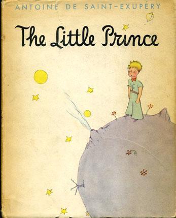
These images are all from an art instructional book (for painters) on color. The descriptions (and the whole book) are fairly rudimentary and simple - as are most instructional books that try to take place of a class or actual practice. I do not know how "mixing together any two secondary colors" equals a tertiary color. I was taught (and it is common color knowledge) that tertiaries are made by mixing a secondary with one of it's two primaries next to it on the color wheel. Such as Yellow-Green and Blue-Violet. Maybe color was taught differently in 1967? That might explain why the Coal City Public Library was giving it away in a free pile. The illustrations of light acting are really beautiful and odd though - visual and solid renditions of what light looks like. Also, the little "doll" in the "Ominous Shadows" illustration looks like the little prince. All images and text are from: Color, A Complete Guide for Artists. Fabri, Ralph. Watson-Gill, 1967.

This find causes me to question myself as an art teacher. How can I really get abstract ideas (such as painting light) across to my students? It is clear that this book has specific and determined ways of representing light that narrow and determine the reader/maker's way of rendering light. I hope that my pedagogical tactics and strategies are not restrictive in this way. I want my students to solve problems for themselves, in their own way. Ideally, I am the facilitator of this problem and subsequent solving.