Showing posts with label color. Show all posts

Monday, July 27, 2015

Everyday: 7/27/15

The Colonial Collection

Thursday, May 21, 2015

Everyday: 5/18/15

Graph (for Pamela Fraser) (found objects) 2015

Wednesday, January 7, 2015

three poems from my visit to Lowe's (Irving, TX)

Olympic (C55a/C55b)

Subtle Blue
Adrift
Hide-and-Seek

Granite Falls
Brigade
Shimmering Sea
*****

Olympic (D56a/D56b/D57a/D57b)

April Sky
Lunar Eclipse
Smoke Screen

Feldspar
Lava Gray
Midnight Hour

Winter’s Day
Going Gray
Gray Frost

Steeple Gray
Volcanic Ash
Black Forest

*****
Valspar (4008-1/4008-2/4008-3)

Bay Waves
Polished Silver
Stone Mason Gray

City Storm
Almost Charcoal
Muted Ebony

Rising Tide
Lighthouse Shadows
Silver Fox

Thursday, January 3, 2013

people, clothes, and Kelly

it makes me really happy that this happens!


Morgane Tschiember - "3 Mouvements" in front of Ellsworth Kelly's piece, MoMA, New York, 2008

Morgane Tschiember - "3 Mouvements" in front of Ellsworth Kelly's piece, MoMA, New York, 2008

Friday, December 17, 2010

paint spectrum poem

Behr Premium Plus

150 B

Pink Eraser
Cherry
Firecracker
Poinsettia

250B

Coral Gold
Orange Spice
Poppy Glow
Crushed Oranges

350B

Lemon Souffle
Straw Hat
Wildflower Honey
Chickadee

450B

Green Trance
Lady Luck
Formal Garden
Green Grass

550B

Costa Rica Blue
Windjammer
Isle of Capri
Blue Ocean

650B

Violet Fields
Garden Pansy
Elite Wisteria
Mystical Purple

750B

Prestige
Castle Hill
Tree Bark
Thick Chocolate

*****************************

i've been considering this poem, or some variation of it, for quite a while. in an advanced creative non-fiction class i took during grad school i wrote a similar piece about 1 sheet of 4 colors of green (each color was written about as a color/trigger for a memory/story). this may not be the final form of this piece, but it is a nice start. as i use found things (objects/images) in my visual practice, i am here using the found as structure for writing - in this particular case the found IS the writing.

Saturday, April 3, 2010

COLOR (and light)


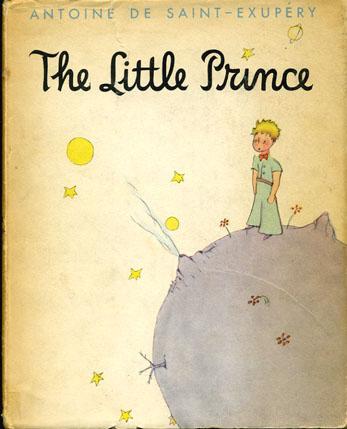
These images are all from an art instructional book (for painters) on color. The descriptions (and the whole book) are fairly rudimentary and simple - as are most instructional books that try to take place of a class or actual practice. I do not know how "mixing together any two secondary colors" equals a tertiary color. I was taught (and it is common color knowledge) that tertiaries are made by mixing a secondary with one of it's two primaries next to it on the color wheel. Such as Yellow-Green and Blue-Violet. Maybe color was taught differently in 1967? That might explain why the Coal City Public Library was giving it away in a free pile. The illustrations of light acting are really beautiful and odd though - visual and solid renditions of what light looks like. Also, the little "doll" in the "Ominous Shadows" illustration looks like the little prince. All images and text are from: Color, A Complete Guide for Artists. Fabri, Ralph. Watson-Gill, 1967.

This find causes me to question myself as an art teacher. How can I really get abstract ideas (such as painting light) across to my students? It is clear that this book has specific and determined ways of representing light that narrow and determine the reader/maker's way of rendering light. I hope that my pedagogical tactics and strategies are not restrictive in this way. I want my students to solve problems for themselves, in their own way. Ideally, I am the facilitator of this problem and subsequent solving.

Thursday, January 28, 2010

big bang

test of Big Bang, I need a different extension cord

Driving down I-80 from Chicago to Joliet I came up with an idea for a piece called Big Bang. It is (or will be) made of an extension cord, 3 light bulb plugs, and 3 light bulbs (red, blue, green). The colors of the light bulbs are the primaries of the light spectrum; when combined the three colors make white light. I thought this might symbolize the first creation of light, but I've now realized that light was not produced by the universe until 300,000 years after the big bang. I will have to re-think this piece, but I think it can still work in a similar (astronomical and humble) manner.

chart of the big bang

perhaps I could reference this with my light bulbs...

Thursday, January 7, 2010

Moment (Spectrum/Cigarette Wrapper) (digital print) 2009

I took this photo in my old apartment. I own 2 small tear shaped prisms (the type found in road-side gift shops) and one of them was making awesome rainbows in the living room one morning. This spectrum was hitting a cigarette wrapper (the plastic and paper) that my roommate had left on his gray plastic shelving unit. The cigarette paper is reflecting the blue light onto the shelf (seen to the left of the wrapper). Like the opalescent gift tissue in my piece The Mystery of Sprites and Jets the reflective surface of the paper absorbs all colors except for one. In this photo blue in reflected; in Sprites and Jets green (to a lesser extent yellow and blue) are reflected.

The Mystery of Sprites and Jets (detail of installation at University Galleries, ISU) (gift tissue, opalescent thread, glue, lamp) 2009

The mystery I am addressing in the above pieces is the enactment of light; what light can do. There is a certain cultural fascination with light and light effect (black lights, strobe lights, night lights, fireworks, Christmas lights, northern lights, etc) that I share and am interested in dissecting and altering into surprising and new displays of objects, color, and light. In Sprites and Jets the mystery is exemplified by the title referent: the electrical storm effects (similar to lightning, but above the clouds) called red sprites and blue jets.

diagram of red sprites, blue jets, elves, and lightning

fist color photograph of a red sprite, taken from an airplane

The reference to the meteorological effect was first by aesthetics (the colors are similar), but was soon followed my mystique. Before they were widely know airplane pilots often commented on these strange occurrences that happen only during electrical storms; a weather condition that already came with it's own awe and other-worldly experience. Not much is known about the characteristics, function, or cause of sprites and jets still.

The added magic of this upper-atmosphere event was a welcome and planned addition to my interest and display of 'light doing weird things' in the above mentioned photograph and sculpture. I feel that the humble way (through poor and commercial material and size) I am addressing these grandiose concepts in a surprising and refreshing way. Stepping back, what I'm really saying is' "garbage can be magical too!"

Below are some images of a few pieces I've recently come across by Charles Ross and Nancy Holt that I like to think of in concert with my above mentioned ideas. [although artists like James Turrell, Olafur Eliasson, Robert Irwin, Dan Flavin, Spencer Finch, Felix Gonzalez-Torres, and a host of other people (mostly men and modernists evidently) could be mentioned here too]

Charles Ross - 4 over 5 +72, 2005

Charles Ross - Double Dispersion, 1972

Charles Ross - Conversations with the Sun, 2004

Nancy Holt - Mirros of light (650W quartz lights, mirrors) 1973-4

Sunday, December 6, 2009

Dots, Circles, and Points

I've been reconsidering the Dot series of works. They live as a strong aesthetic form, with some connection to found ephemeral objects and a type of idiosyncratic signature. In my search of the meaning of these forms I ask myself, 'What does the dot mean?' I think by switching the context (the paper the dot is on) can inform this. What if the dot appeared on a map?

The concentric circles mimic (although abstracted) the points that are locations on the map. There by the form of the dot becomes a strange place - such as a blast zone, abstracted roads/map-forms, or aesthetic intervention. Most importantly the form of the dot fits the context of the map through shape and colors.

Chernobyl fallout zone

Dot as place and location. The following Kleenex box was photographed in Florence, MA.

Sunday, October 11, 2009

I'm black, I'm white

search 1
search 2

searches of "michael jackson" using Google image color filter

Monday, June 8, 2009

Dots

The Light of God Dot, acrylic on found paper 2009

memory and color

found
rough red truck
parked in a grey lot
billboards above shed their halftone ads
candy gumdrops from Target
grave for hand written notes

the streets and sidewalks glitter
.......with cultural flotsam and jetsam

he finds his surrogate history
he makes his mark on time
he makes his mark on time he makes
his mark on time
he makes

***
I've been making these "Dot" pieces for around 4 years now, and I'm still trying to figure them out. This should be viewed as a presentation about my pieces involving dots and their relation, in concept and form, to the following information.
The dots began a simple color tests and a way for me to teach my self color theory and interaction. Soon there after they became more structured. The dots are always painted, one circle in the middle of another, usually on found paper. The color of the dot parts are always in response to each other, with slight respect to the color of the found paper. The middle of the dot is always gloss, the outside ring is always matte. They act as my own stamp, or symbol, on top of something that is lost and ephemeral. I've realized I'm drawn to circles because they are the most complete and contained shape; in a way, they are inescapable (a thought completed and borrowed from Thomas Downing).


Thomas Downing, Red Plum, acrylic on canvas 1961

The exhibition catalog for Thomas Downing's show Origin of the Dot (Conner Contemporary Art, Washington, D.C.) contains a series of letters from Thomas Downing to Vincent Melzac, from which the following quote was taken.
"One of the more intelligent questions asked regarding my work was asked by a child. The question was 'Why do you paint circles instead of squares?' My answer at the moment was 'because circles are easier to paint. There are no corners to go into and then get out of.'
---
Dealing with color requires full attention... When from two to twenty-two clearly different colors must also be taken into consideration, nothing short of total absorbtion (sic) is required. Nothing more difficult than a full round circle will allow either the time or energy to deal with color."
Another circle painter god is Kenneth Noland. But these forms are not only found in art and I am also drawn to them in culture; in particular targets and graphic design.

Kenneth Noland, Mysteries: Afloat, 2000

Bridget Riley - Untitled, gouache and pencil on paper 1970

sponge target and Ohio flag in my studio

Barack Obama's 2008 campaign logo

On Kenneth Noland and his circles Terry Fenton writes:
"When the center of art shifted to New York in the '40s, this abstracting Cubism was inherited from the School of Paris. By the 1950s, it was under pressure from many American artists. Jackson Pollock, Mark Rothko, Morris Louis, Adolph Gottlieb, Robert Motherwell -- all made abstract paintings which had a vague, symbolic association in their imagery.

So did Noland's early 'Circles,' which were surrounded by painterly penumbras. Realizing that these target-like motifs could stand on their own as simple, geometric layouts, by 1960 he'd turned to unadorned unsymbolic circles. These latter concentric circles were just circles; every vestige of representation or allusion in the drawing of them had been expunged. Graphic allusiveness had been taken over by color."

Fenton, Terry. "Appreciating Noland." 2001. Tue. 9 Jun. 2009. http://www.sharecom.ca/noland/apnolandindex.html


Funeral Dot, acrylic on found paper 2008

Mission Read Dot, acrylic on found paper 2007

Party! Dot, acrylic on found paper 2008

installation of Dots

And because I can not avoid a pun and what might be perceived as bad idea:

Dots, acrylic on box 2008